

It’s about making a notoriously slow-footed company faster on its feet — which could eventually pay off for its users
Something unusual happened this week: Twitter got a major redesign, and people hardly freaked out at all. That might be because most of the updates appeared cosmetic, even trivial. But the project’s true aim — according to its lead designer Ashlie Ford — was to make Twitter easier for Twitter to use. And that, in turn, could mean a better Twitter for everyone, eventually.
The long-awaited revamp of Twitter.com rebuilt the desktop website from the bottom up as a progressive web app and merged it with the former mobile website. The makeover was met with a collective shrug, and scattered snorts of derision. (Did they get rid of the Nazis yet? Still no?) But the updates start to make more sense when you realize that they aren’t really about changing how people use Twitter — at least, not immediately. They’re about changing the company’s internal culture, and in doing so, paving the way for Twitter to fix all kinds of problems, large and small, in the future.
Twitter, as a company, seems to spend most of its time in various stages of existential crisis. Lately it has been rethinking everything as it tries to figure out how to address rampant harassment and hate speech and how to make its platform more conducive to civil, human conversation as opposed to dunking, trolling, and general cacophony. So one would expect that the first overhaul of its website in seven years might try to tackle these problems in substantive ways. After all, a platform’s design draws the boundaries for its use.
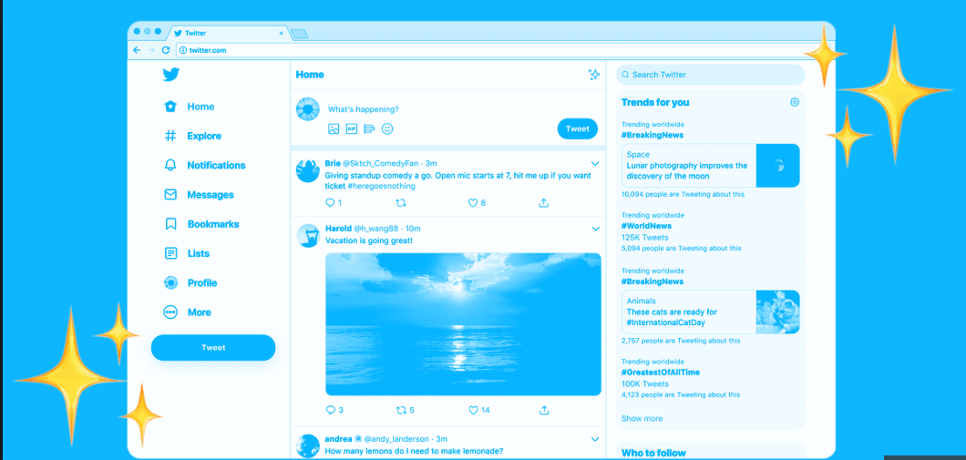
Instead, we got a series of seemingly surface-level tweaks that passed with surprisingly little notice, given the long history of Twitter’s loyal users reacting with nearly comical outrage to almost any significant change to the platform. (Remember the fury over threaded replies? The algorithmic timeline? The move to 280 characters?) Among the updates: The main navigation bar moved from the top of the page to the side, there are a handful of new buttons and features ported from the mobile app, and the site as a whole became cleaner and more responsive.
The changes are modest, including minor features that could prove useful, like making it easier to find lists and bookmarks, navigate direct messages, or toggle between your algorithmic and chronological timelines. But the redesign is more consequential than it appears. It might even mark a quiet turning point for a social network that has long lagged behind rivals in improving and building on its core product.
The company rebuilt the technology underpinning the website because the old one had become kludgy and outdated on the back end, making every change an exercise in bureaucracy and frustration for the company’s own software engineers.
“The legacy site was built on an old tech stack,” Ford told me in a phone interview. “It was really hard to update, and because of that, it didn’t get updated very often.” The new site, she said, “was built entirely from the ground up, and so it is much faster to prototype, experiment, and roll out new features.” It is now what’s called a progressive web app, loading faster and adapting readily to different devices and screen sizes.
In the process, it has become much more similar to Twitter’s native mobile apps, which makes it easier for designers and product managers to sketch out how an idea would work on each. Previously, the company’s changes tended to come first to its mobile apps, migrating to the web only much later. A post on Twitter’s engineering blog underscored that the redesign’s number one priority was to “make it easier and faster to develop new features for people worldwide.”
Ford said the company hopes the rebuild will not only make life easier on existing employees, but help to attract new ones. That can be critical for Silicon Valley tech firms, which compete intensely for the most capable software developers.
If they work as promised, the changes could help Twitter shed its reputation for moving like molasses while its competitors seem to be in hyperdrive. The social media reporter Casey Newton observed in 2017 that Twitter couldn’t figure out how to build an edit button, while Facebook was working on ways to let you type with your mind and hear with your skin.
Of course, the inability to rapidly test and ship changes hasn’t been Twitter’s only problem. The company has also been notoriously slow to make hard decisions, which can be a virtue, but starts to look more like negligence when users have been suffering the consequences of its inaction on the same problems for years. Empowering the company’s workers to test out ideas will only help if Twitter’s top management is willing to give some of them the green light.
Twitter has already been toying with some interesting ideas in its mobile apps. While the desktop app makes lists more accessible, a current test version of the iOS app goes even further to make them an integral part of the platform: Swiping right from the home timeline toggles between a series of “pinned” lists, making Twitter feel more like its power-user-oriented subsidiary, TweetDeck.
Twitter wouldn’t say if or when it might make that change for all users, though Ford told me the company is interested in boosting list usage, and has already seen an uptick from the desktop redesign. That shift could help to make Twitter less of a single-room shouting match and more of an interest-based network — or it could backfire by encouraging people to circulate lists intended to doxx, intimidate, or harass. Either way, the back-end changes will make it easier for Twitter to quickly test out and implement these sorts of ideas for a wider range of users, without requiring people to download beta versions of the app.
In a similar vein, the new desktop site has incorporated a change pioneered in the mobile app that allows a user to switch between multiple accounts from their home timeline. Twitter told Wired that was motivated partly by users in Japan, where it has become common to create different accounts for different interestsand purposes.
Some other changes previously tested in mobile apps, such as removing reply and like counters from certain views, have not been brought into the desktop redesign thus far. But there is one change in that general direction: The website no longer displays your follower count on your home timeline, forcing you to navigate to your profile page if you want to see how you’re faring in the great popularity contest.
Critics who point out that Twitter’s big redesign has done nothing to fix its fundamental problems are correct. But it should at least make the company a little lighter on its feet from now on — so it can move on to making the sorts of substantive changes that could really make a difference. Or at least really piss people off.
All Rights Reserved for Will Oremus
