

It’s the most exciting release in a long time — if you have a Pixel phone
Android 12 has been in beta testing for about half a year now, and Google apparently still isn’t quite done. The company may have pushed out the final version to AOSP, but the release has yet to roll out in stable on Pixel phones. This is unprecedented, as Google usually publishes new Android AOSP releases right along with their Pixel counterparts, but yet, here we are — it seems like the company wants to continue its quest to decouple its flagship phones from regular Android releases.
But even though Pixel phones haven’t received their final release of Android 12 just yet, we can get an almost perfect picture by looking at the last Android 12 beta — and that’s exactly what I did. I’ve been using Android 12 on my Pixel 3 throughout most of the beta phase, so I’ve got a pretty good idea of how it feels and works. You should also keep in mind that this review refers to Android 12 on a Pixel phone — not all features will come to other phones in the same capacity.
Pros
| Redesign | Android was starting to look a little old in the tooth, and Material You is a refreshing new approach to design. |
| Universal Search | I’m still not quite used to it, but when I remember it’s there, it speeds up the process of finding contacts, settings, and apps considerably. |
| Better permission management | Privacy Dashboard, indicators and quick toggles for mic and camera access, and more granular location permissions are thoughtful additions. |
| Game Dashboard | Finally, a game dashboard for Pixels, even if it doesn’t feel quite finished. |
Cons
| Too many Pixel-exclusive features | From what we can tell, a lot of stuff will come to Pixel phones before other brands will be able to enjoy it. |
| Google Pay and device controls shortcuts | The power menu has been demoted, and accessing Pay and device controls via quick toggles is now much more tedious. |
| New Internet quick toggle | It replaces the standalone Wi-Fi and mobile network toggles, making things take a little more tedious |
| Unfinished bits and pieces | Themed icons, Live Space, and the Game Dashboard don’t feel finished in the last beta, and only the former has a proper beta tag attached to it. |
Design and interface
Android 12 is the biggest interface change since Android 5 Lollipop. It comes with a brand-new design philosophy called Material You. It’s basically an advanced theming engine that makes the interface respond to the dominant colors in your wallpaper, ensuring that basically no two phones look the same. This applies to every last system-level UI element on Pixel phones, including the lock screen, notification shade, settings, widgets, icons, Discover feed, Gboard, charging animation — basically anything you could think of. Even apps can hook into this system and adjust their themes accordingly.
:extract_focal()/https%3A%2F%2Fstatic1.anpoimages.com%2Fwordpress%2Fwp-content%2Fuploads%2F2021%2F10%2FAndroid-12-review-2.jpg%3Fq%3D50%26fit%3Dcrop%26w%3D5472%26dpr%3D1.5)
It’s certainly a divisive design direction, but so far, it looks like Google is pouring tons of resources into getting all of its apps up to par ahead of the stable release, giving me hope that the company will finally make sure that everything looks like it’s made with the same building blocks. There are even a few third-party apps that take advantage of the theming system already (like Tasker or Inware), but I fear that a lot of other big developers like Facebook, Twitter, and Microsoft are more concerned with keeping their apps in line with their own corporate design and colors.
If you don’t like this dynamic theming at all or would prefer to choose colors independently from your wallpaper, that’s possible, although options are severely limited. Depending on your wallpaper, there are up to four slightly different themes to choose from, and there is a total of four “base” themes independent from your wallpaper: blue, green, violet, and brown.
:extract_focal()/https%3A%2F%2Fstatic1.anpoimages.com%2Fwordpress%2Fwp-content%2Fuploads%2F2021%2F10%2FAndroid-12-review-1.jpg%3Fq%3D50%26fit%3Dcrop%26w%3D5472%26dpr%3D1.5)
Google has also started implementing Samsung-like app bars in some apps, with huge titles that sit far away from the top of the screen until you start scrolling, which is when the font shrinks back down to a regular app bar. It’s supposed to help with one-handed use and reachability with smartphone screens growing ever taller. However, so far, we’ve only seen this behavior in a few system apps like settings, so I’m not entirely sure if Google is going to seriously pursue this design in the short term. In any case, app and device developers are encouraged to use Google’s guidelines for big app bars going forward.
The overhaul is so massive that even the overscroll animation hasn’t been left untouched. Instead of the familiar sticky glow effect that Android 11 and below use, Android 12 comes with a new stretch animation. It looks just a bit like the iOS overscroll solution, but it feels less playful as it doesn’t really bounce. Elements at the top stick to the top, so it feels more like stretching a rubber band rather than bouncing a rubber ball.
Notifications, lockscreen, and UX
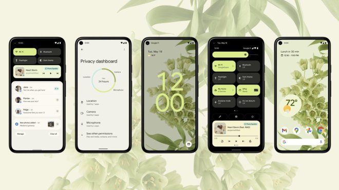
The interface changes aren’t limited to theming and Material You. Everything is more rounded and playful throughout the Pixel interface, starting with the huge clock displayed on the lockscreen when you don’t have any notifications. It moves over to the top left when you do have messages and other pings waiting for you. Not even the PIN entry screen has been left untouched, which now comes with round buttons and a monocolor background; your wallpaper is no longer visible during entry, much like the notification shade. Other than losing its transparent background, the notification shade now organizes pings in rounded bubbles, divided in the same groups as before: Conversations, notifications, and silent. Up top, you only see four quick toggles at a time (down from six on Android 11), living in new pill-shaped chips colored based on your wallpaper. When you listen to music or other media, you’ll also find playback controls right beneath the quick toggles, like you used to.
:extract_focal()/https%3A%2F%2Fstatic1.anpoimages.com%2Fwordpress%2Fwp-content%2Fuploads%2F2021%2F10%2FAndroid-12-review-5.jpg%3Fq%3D50%26fit%3Dcrop%26w%3D5472%26dpr%3D1.5)
The Wi-Fi and mobile network quick toggles have also made way for a unified Internet chip that you need to tap before you can choose to turn on or off Wi-Fi and/or your mobile connection. It may take up less space, but it’s more cumbersome and less intuitive than having two dedicated buttons for either.
:extract_focal()/https%3A%2F%2Fstatic1.anpoimages.com%2Fwordpress%2Fwp-content%2Fuploads%2F2021%2F10%2FAndroid-12-review-7.jpg%3Fq%3D50%26fit%3Dcrop%26w%3D5472%26dpr%3D1.5)
As part of all these redesigns, the power menu has been demoted back to its original state, pre-Android 11. It only shows Power off and Restart options alongside Emergency and Lockdown (which will deactivate your biometric login options and require you to enter your PIN code). GPay and home controls are now available on the bottom of the lock screen or in the quick settings in the notification shade. Given that Google has just made the power menu more powerful with the preceding Android release, it’s a decision I can’t understand. Accessing cards and home controls now takes at least two steps, while you could just press and hold the power button before to get there.
:extract_focal()/https%3A%2F%2Fstatic1.anpoimages.com%2Fwordpress%2Fwp-content%2Fuploads%2F2021%2F10%2FAndroid-12-review-12.jpg%3Fq%3D50%26fit%3Dcrop%26w%3D5472%26dpr%3D1.5)
Speaking of long-pressing the power button, Android 12 has changed the shortcut to be in line with how many third-party manufacturers already use it: invoking Google Assistant. It’s safe to assume that the pressure-sensitive sides for Assistant access are not coming back to Pixel phones anytime soon. At least the power menu can still be accessed quickly by pressing the power and volume up buttons simultaneously, though with most of its functionality stripped, you likely won’t need to open it all that often. Thankfully, the new long-press Assistant shortcut is optional on older phones, but that doesn’t change the fact that the power menu is now mostly stripped bare.
This reorganization is annoying enough for those of us who live and breathe Android day in and day out, but I don’t even want to imagine how it will frustrate people who will be left standing at the checkout, unable to access their GPay cards the way they usually do. I know that the new long-press shortcut is meant to put Assistant front and center, but there’s no good reason to strip the power menu empty when you leave it easily accessible via a new shortcut.
Homescreen and widgets
The Pixel Launcher homescreen has also received a small makeover. The changes become particularly apparent when you enable themed icons, which give you monochrome app icons that pull their colors from your Material You theme and wallpaper. However, Google was quick to add a beta label to the feature. Only Google apps currently support it, and then not even all of them. There’s no public API for third-party developers to take advantage of this yet, and like with Material You itself, it’s questionable if bigger companies like Facebook are going to be okay with changing their logo for every user. Using themed icons right now makes for a much busier and outright broken-looking homescreen if you dare install anything but Google apps on your phone.
:extract_focal()/https%3A%2F%2Fstatic1.anpoimages.com%2Fwordpress%2Fwp-content%2Fuploads%2F2021%2F10%2FAndroid-12-review-19.jpg%3Fq%3D50%26fit%3Dcrop%26w%3D5472%26dpr%3D1.5)
Outside of themed icons, the At A Glance widget at the top of the default home page has been replaced with Live Space, which is left-aligned and feels a little broken in its current beta state, with settings not functional and the weather report completely vanished. If the teased and leaked Pixel 6 screenshots are to be believed, Google wants to make this widget quite a bit more useful. It should be able to display upcoming flights with a check-in QR code visible right on your homescreen, and there appear to be options for third-party apps to hook into it, too.
:extract_focal()/https%3A%2F%2Fstatic1.anpoimages.com%2Fwordpress%2Fwp-content%2Fuploads%2F2021%2F10%2FAndroid-12-review-3.jpg%3Fq%3D50%26fit%3Dcrop%26w%3D5472%26dpr%3D1.5)
In fact, widgets in general are bound to make a comeback in Android 12, at least if third-party developers jump on Google’s bandwagon. By default, all widgets now come with rounded corners that fit right into the new please-no-sharp-edges design language, and developers can tap into Material You’s engines to extract the underlying wallpaper colors to be used as their widgets’ backgrounds. Google is extensively doing this with the all-new widgets for its own apps, like Clock, Calendar, Drive, Chrome, and Keep, but it remains to be seen how many other developers will join in. A few of Google’s widgets also support Android 12’s new widget editing tool that only exposes an edit button when you long-press it, which is quite a step up compared to older widgets that had to leave a gear icon permanently in view if you wanted them to be editable.
At some point, Google even experimented with stacked widgets à la iOS, but for now, it doesn’t look like they’ll be ready to be used any time soon. Maybe in Android 13?
New features
Universal Search
Even though Android 12 is laser-focused on color and design, it does have a few noteworthy features in tow. My personal favorite on my Pixel 3 is Universal Search, which Google brought back from the Android archives (just remember the dedicated hardware search button on early phones). It’s only accessible when you swipe up on your homescreen to open the app drawer and hit the search bar (but you can also flip a toggle that automatically opens the keyboard once you enter the app launcher). You can search for apps like you used to, but the results are also comprised of contacts, settings, Pixel Tips, and app shortcuts, giving you a pretty powerful selection of tools.
:extract_focal()/https%3A%2F%2Fstatic1.anpoimages.com%2Fwordpress%2Fwp-content%2Fuploads%2F2021%2F10%2FAndroid-12-review-9.jpg%3Fq%3D50%26fit%3Dcrop%26w%3D5472%26dpr%3D1.5)
I’m still not using it as much as I’d like to (muscle memory be damned), and I wish there were more powerful tie-ins with Google apps like Maps, Calendar, and Keep, not to mention third-party apps like WhatsApp. For some reason, Slack integrates really nicely with it already, with almost all of my DM contacts available, so there might just be an API that other apps can use, too. Once more apps work well with Universal Search, I definitely see the potential. It’s not quite Sesame just yet, one of the best third-party universal search tools for Android, but it’s getting there. (If Google doesn’t abandon it in the next release, of course.)
Scrolling screenshots
Another boon for Pixel users is scrolling screenshot support, which almost all other manufacturers have already added to their phones themselves. Google says it wanted to get the implementation right, and it does seem to be the most solid solution I’ve seen yet. There were some initial issues where the feature didn’t work on webviews (like in Chrome or some app’s custom views), but the quirks are mostly fixed. While some manufacturers make long screenshots by automatically scrolling through the current view until you tell the tool to stop, Google lets you dynamically choose which parts you want to save without relying on some hacks, and it works really well for the most part.
Permissions
As with most recent Android releases, Google has also added improvements in the permissions department. Android 12 introduces a new Privacy Dashboard that shows which apps have accessed which of your device’s permissions over the past 24 hours, with a focus on location, microphone, and camera. You can view a timeline of when exactly individual apps have accessed which data, and there are shortcuts for jumping right into an app’s permissions overview to turn off anything you don’t like right then and there. You can expand the view to see almost all permissions there are: Body sensors, calendar, call logs, contacts, files and media, nearby devices, phone, physical activity, and SMS.
:extract_focal()/https%3A%2F%2Fstatic1.anpoimages.com%2Fwordpress%2Fwp-content%2Fuploads%2F2021%2F10%2FAndroid-12-review-13.jpg%3Fq%3D50%26fit%3Dcrop%26w%3D5472%26dpr%3D1.5)
Google has also further improved its sensitive location permission after already making it much more granular in Android 10 and 11. It’s possible to give apps access to your approximate location only, which is useful for services like weather apps that don’t need to know where exactly you are to provide you with relevant information. Right now, most apps don’t work with the respective APIs though, with them claiming that they have no location permission at all when the approximate option is enabled.
:extract_focal()/https%3A%2F%2Fstatic1.anpoimages.com%2Fwordpress%2Fwp-content%2Fuploads%2F2021%2F10%2FAndroid-12-review-14.jpg%3Fq%3D50%26fit%3Dcrop%26w%3D5472%26dpr%3D1.5)
Then there are new quick settings toggles in your notification shade that allow you to turn off camera and microphone access for all apps on your phone at once, globally. This comes in addition to the new microphone and camera indicators that pop up in the top right corner of your screen whenever an app accesses either. After showing you a small icon of either a microphone, a camera, or both, a green dot will remain permanently visible until the app in question has stopped using the permission.
Game Dashboard
In contrast to other manufacturers’ gaming features that have been long available, Google’s new Game Dashboard is still pretty barebones, finicky, and — frankly — of limited use. When playing games, it shows up as a permanent floating panel that you can move around as you need, though it interferes with gesture navigation pretty easily. In the dashboard itself, it’s possible to add up to three more options to the floating panel: One for screenshots, one for video recordings, and an FPS counter. There’s also a DND button to quickly stop new notifications from coming in. With my Material You theme, it’s pretty hard to tell which of these buttons are activated and which aren’t, with nothing but a slight change in hue and a weird button shape morphing from squircle to circle showing what’s active and what isn’t.
:extract_focal()/https%3A%2F%2Fstatic1.anpoimages.com%2Fwordpress%2Fwp-content%2Fuploads%2F2021%2F10%2FAndroid-12-review-15.jpg%3Fq%3D50%26fit%3Dcrop%26w%3D5185%26dpr%3D1.5)
There’s also a shortcut to start a YouTube livestream of your gaming session right from mobile, but here’s the kicker: YouTube only allows channels with more than 1,000 subscribers to start live streams right from their mobile devices, making this big ol’ button essentially useless for the vast majority of gamers on Android. Even if YouTube lowers the limit at some point after the stable Android 12 release, most people probably won’t touch this button ever again once they’ve noticed it doesn’t work for them.
The dashboard also adds optimization options for a few titles that let you choose between sacrificing battery life for the best possible performance and playing without access to an outlet for as long as possible. Developers have to implement support for this to work, though.
:extract_focal()/https%3A%2F%2Fstatic1.anpoimages.com%2Fwordpress%2Fwp-content%2Fuploads%2F2021%2F10%2FAndroid-12-review-16.jpg%3Fq%3D50%26fit%3Dcrop%26w%3D4894%26dpr%3D1.5)
In the beta, I had to manually activate the dashboard in settings before I was able to use it, and after exiting a game, I couldn’t get it to disappear, even when turning it back off in settings. Let’s hope this and all the other problems I’ve encountered will be fixed for the stable release.
Another gaming feature that deserves mentioning is Play as you download for the Play Store. The name says it all, but developers need to implement support for it to work, so it might take a while until you encounter the first few titles that utilize this functionality.
Security, APIs, and miscellaneous
As almost any other Android update in recent history, Android 12 has also added new emoji. There are almost 1,000 retouched existing emoji and a few new ones that are part of the Unicode 14 update. Our own Ryne Hager took a deep dive into what’s new, highlighting the most important changes. In even better news, Google is decoupling emoji from system updates starting with Android 12, so you should be getting access to new emoji much faster than you used to. No more broken squares instead of the latest smileys, yey.
Android 10 already improved Wi-Fi password sharing thanks to QR code support, but Android 12 adds yet another option. You can use Nearby Share to send over a password. I doubt that this is faster than just asking a guest to open their camera app and scan the code, but it’s a welcome improvement nonetheless.
There are also quite a few changes under the hood that you might not notice instantly, but that will make life much easier. A new API improves the process of copying and pasting rich content and text across apps, and apps will open faster from notifications thanks to the deprecation of an older system. Third-party alarm clocks are more reliable and accurate due to a new permission, and third-party cameras may be able to use more special camera modes.
For those of us with lots of smart home devices, Android 12 can keep the Wi-Fi connection with your router active while you’re peer-to-peer connected to your latest gadget, at least if your phone supports this on a hardware level.
On the security front, the Android Runtime has become a Project Mainline module, which means that we have yet another piece of the system that can be updated via the Play Store without requiring a full system update, ensuring that devices stay secure even once they don’t receive Android updates anymore.
There are a lot more granular changes, so be sure to check out our unofficial Android 12 changelog with every single new feature we’ve found (so far). We’ll be sure to update it once the final release hits Pixel phones, but in the meantime, it’s still a valuable overview of all the minute changes headed for your phone.
Verdict
Android 12 is the biggest update in a long time, and it shows. Google is still putting the finishing touches on its Pixel flavor of the operating system, even if all the APIs and features can now be considered final. In contrast to older big shifts, like Android 3 Honeycomb (which was only available for tablets) and Android 5 Lollipop (which promised much more than it initially delivered), and compared to Apple’s iOS 7 disaster, Android 12 feels solid and thoroughly thought out. Google managed to create a visual refresh without completely upending tried-and-true workflows, even if there are still too many changes just for the sake of change (looking at you, power menu), and even if there are still many things that need patching and fixing.
:extract_focal()/https%3A%2F%2Fstatic1.anpoimages.com%2Fwordpress%2Fwp-content%2Fuploads%2F2021%2F10%2FAndroid-12-review-8.jpg%3Fq%3D50%26fit%3Dcrop%26w%3D5472%26dpr%3D1.5)
Android 12 is also a paradigm shift for Android as a platform, even more than the last few releases. In the past, Google always made sure to implement as many features as possible for the Android Open Source Project (AOSP), only retaining a small portion of mostly timed exclusive Pixel features. However, this time around, the company put its own Pixel phones front and center, with things like the Material You theming engine remaining exclusive and close-sourced until the last possible moment. This makes sense, with Google finally wanting to turn its hardware business around by running an aggressive marketing campaign for the upcoming Pixel 6 with its custom in-house chipset, but it could lead to an even more fractured Android experience than what we’re used to already.
It’s debatable whether other app developers and yes, even device manufacturers, will follow suit with Google’s new wallpaper-based design, but it’s definitely a bold move that gives Android and Google apps (and, particularly, Pixel phones) unique characteristics for years to come. With Google ramping up its hardware ambitions, that only makes sense.
All Rights Reserved for Manuel Vonau
